Explore examples of our software development, branding, creative design and publishing work. Open a project to see what we created and discuss how we can help with yours.
We rebranded the logo for Remnantouch Foundation to reflect its renewed vision and growing impact. The new design embodies hope, compassion, and transformation, aligning with the foundation’s mission to inspire change and touch lives. Our goal was to create a modern, memorable identity that resonates with both the community and its beneficiaries.
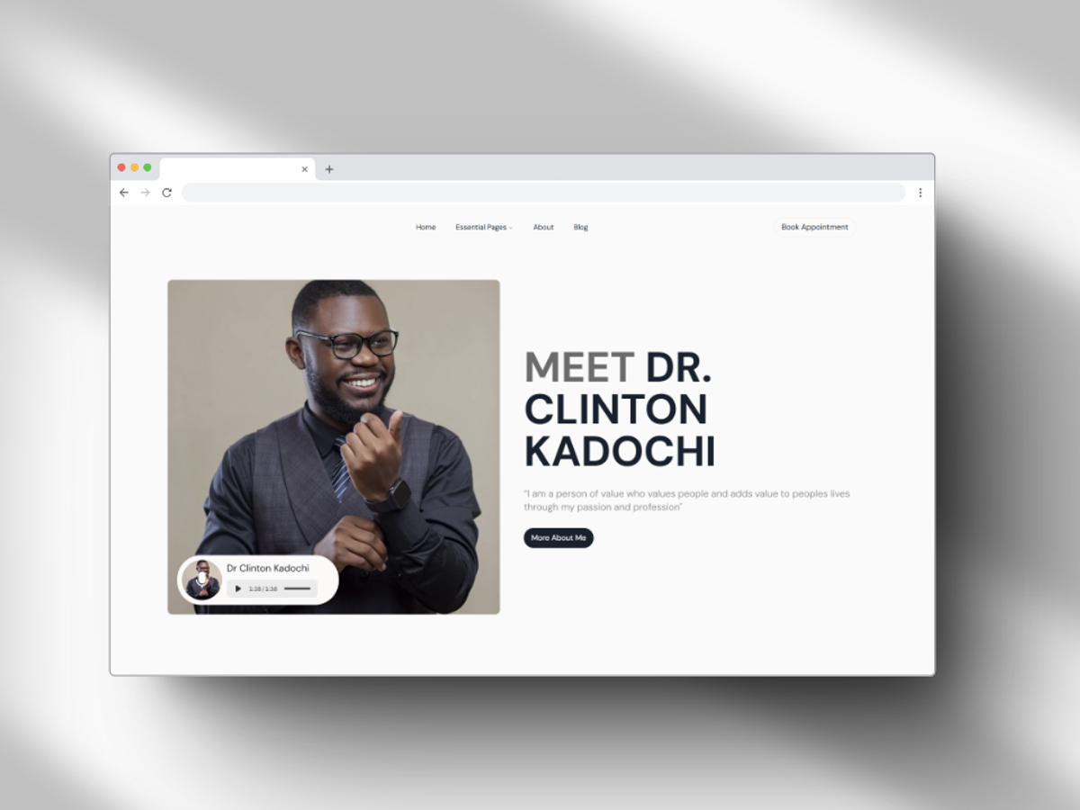
Dr. Clinton Kadochi needed a portfolio website bringing together his work in mental wellness, public speaking, and writing. The aim was to present these areas clearly within a cohesive personal brand. We designed a responsive website with sections for his biography, speaking engagements, blog, and contact information. The work focused on straightforward navigation, fast performance, and SEO, giving visitors a clear way to explore his expertise, services, and written work.
Hot Spot is a platformer shooter created for “Shacknews Jam V: The Final Frontier,” with the theme “Before the NES/FamiCom.” Players protect nuclear bombs from incoming projectiles using power ups based on inventions from before 1983. Our work focused on selecting and balancing these power ups, including the ballpoint pen and microwave oven, so each offered a distinct gameplay benefit. We also refined the controls and retro style visuals to support responsive, challenging play.
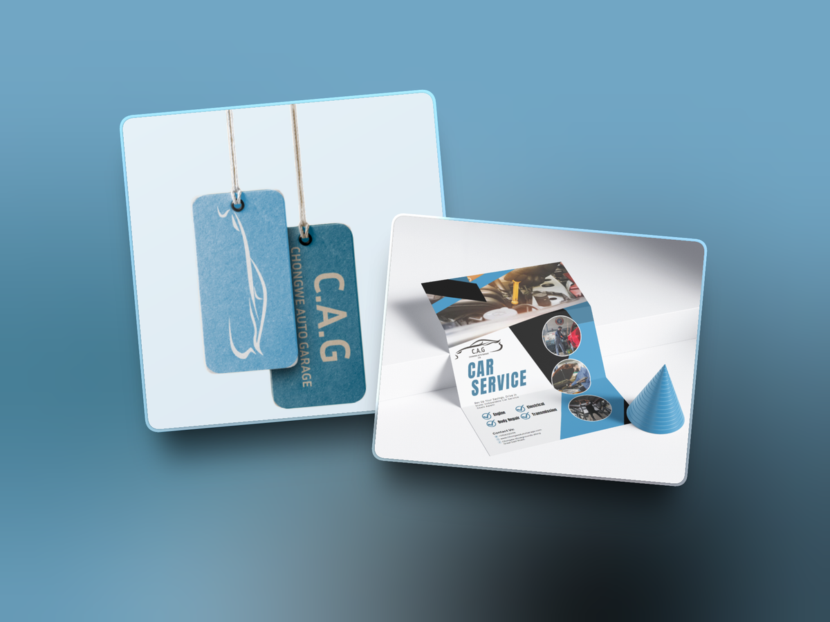
George Bester commissioned branding for Chongwe Auto Garage (C.A.G.) in Chongwe. We researched automotive visual identities, developed logo sketches, and refined the selected concept in Figma for use across print and digital materials. The identity combines deep blue, cream white, and sky blue with Inria Sans Bold and Open Sans. Colours were specified in CMYK and RGB/HEX. We created mockups for shop signage, business cards, stationery, uniforms, social media graphics, and workshop promotions, showing how the identity would work across the business.
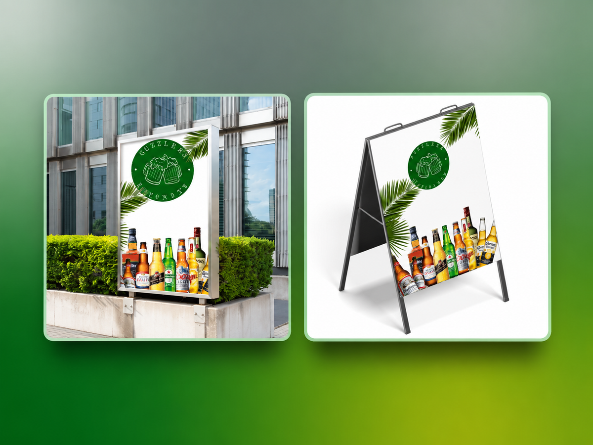
We partnered with Guzzlers Reloaded (Infinity), a bar known for craft cocktails and a vibrant atmosphere, to develop a more consistent brand presence. The work addressed limited visibility, inconsistent messaging, and the need to appeal to both weekday and weekend patrons. We refined the brand positioning around a sophisticated but welcoming voice, developed a modern classic aesthetic, and created the tagline “Where Every Pour Tells a Story.” These elements gave the bar a clearer direction for presenting its identity.
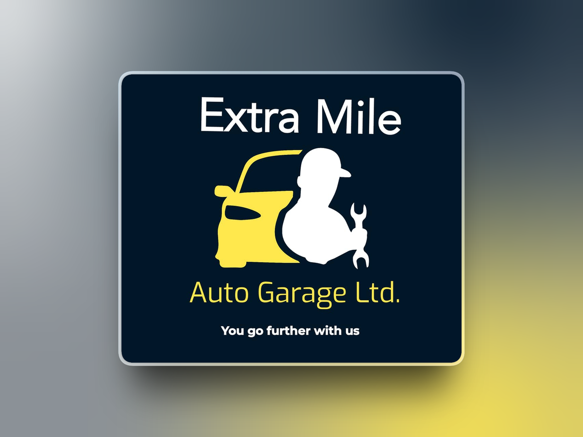
We designed a logo for Extra Mile Auto Garage Ltd. to communicate automotive expertise and dependable service. The design combines a mechanic holding a wrench with a vehicle profile, supported by the tagline “You go further with us.” A navy blue, yellow, and white palette balances professionalism, energy, and clarity. Simple forms and a clear visual hierarchy keep the identity adaptable for signage, uniforms, service invoices, and digital platforms while making the business easy to recognise.
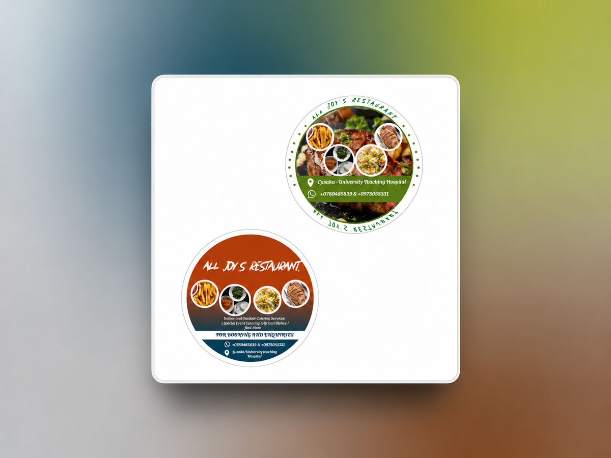
The creation of stickers for Joy’s Restaurant focused on developing visually appealing and easily recognizable designs that reflect freshness, warmth, and approachability. The sticker designs made use of a predominantly green, orange, and white colour scheme, with green representing freshness and growth, orange conveying energy and appetite appeal, and white ensuring clarity and balance. Emphasis was placed on simplicity and strong visual hierarchy so the stickers remain effective across packaging, takeaway containers, and promotional use while reinforcing Joy’s Restaurant’s friendly and inviting brand identity.
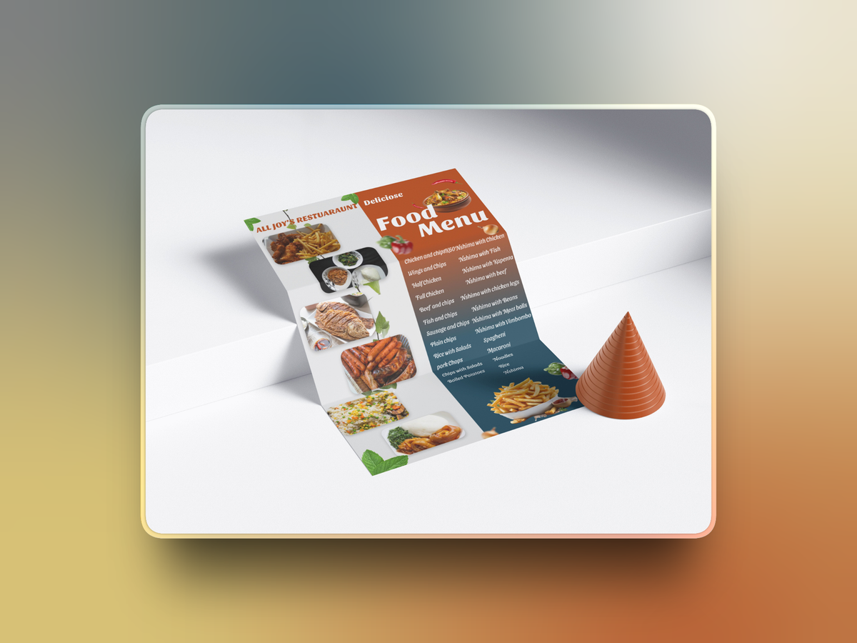
Joy commissioned a brand identity for Joy’s Restaurant that reflected her vision, audience, and dining experience. We developed a palette of rich burgundy and soft cream with sage green accents, specifying colours in CMYK and RGB/HEX for consistent print and digital use. Using Adobe Photoshop, we created mockups for regular and seasonal menus, takeaway packaging, branded bags, business cards, and promotional materials. These previews showed how the logo, colours, and supporting design elements could work together across the restaurant’s customer touchpoints.
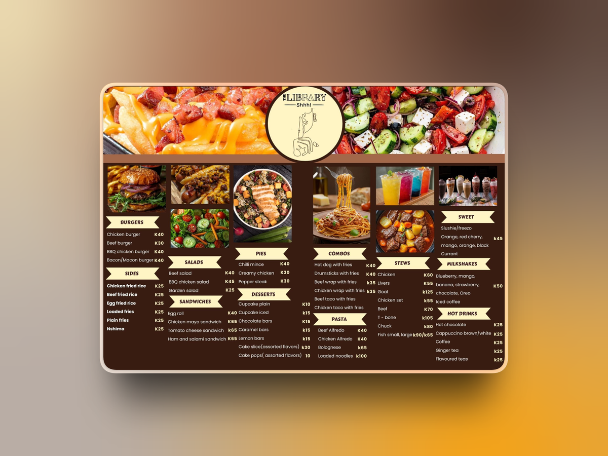
Shhh Library Restaurant needed a refreshed food menu that remained consistent with its existing brand. The focus was on making the offerings easy to find and read while creating a more polished presentation for diners. We designed the menu around the restaurant’s established colour scheme, using typography and layout to organise the content clearly. The finished design brought the food listings into a cohesive format that supported the restaurant’s visual identity and the dining experience.
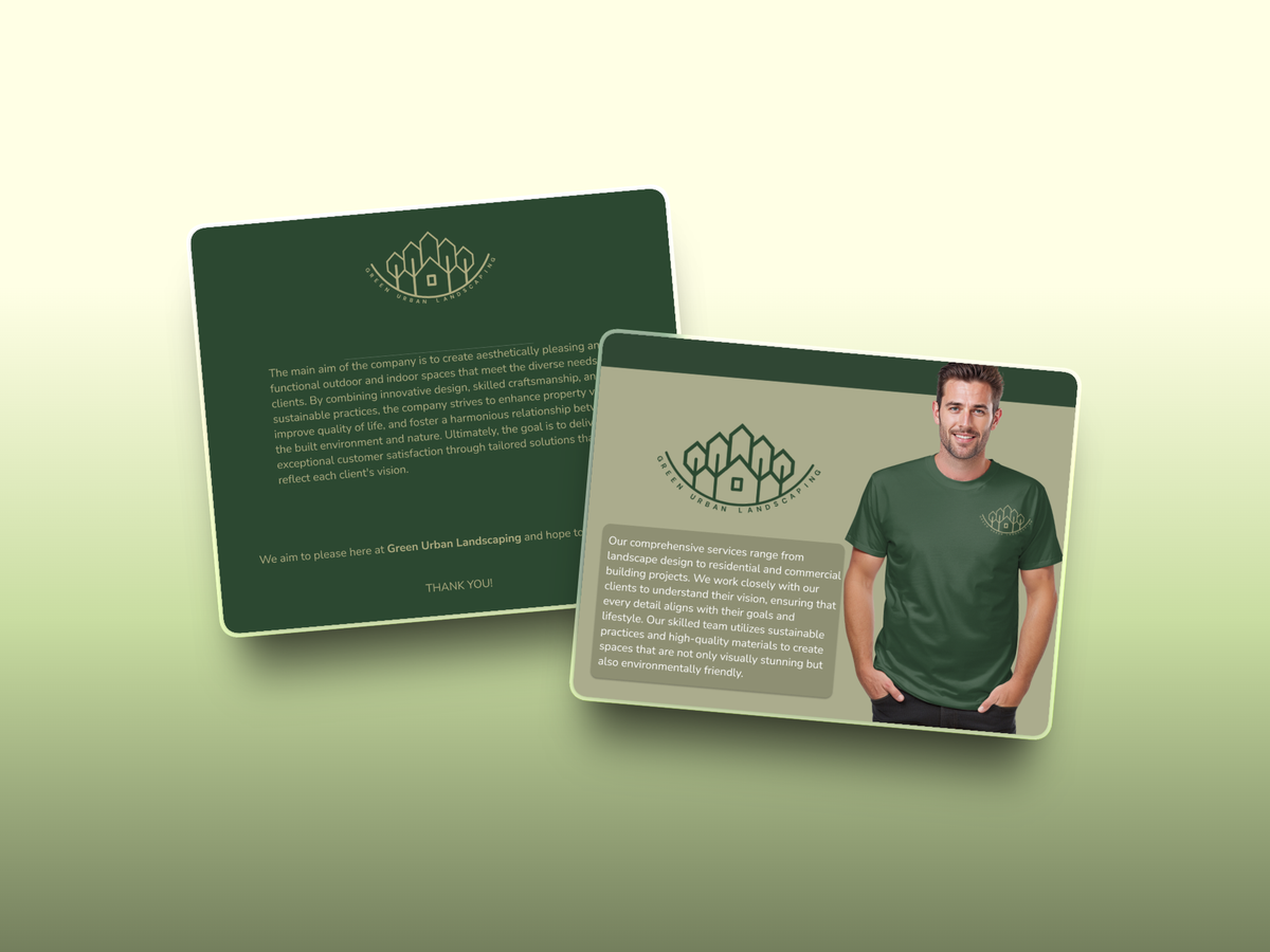
Green Urban Landscaping needed a clearer identity for its sustainable gardening products and landscaping services. Our work focused on communicating its environmental approach and presenting its offering consistently to residential and commercial clients. We refined the visual identity around natural greens, developed the tagline “Bringing Nature Home, Sustainably,” and created tailored branding mockups. Consistent messaging connected the visual direction with the company’s gardening and landscaping work, providing a foundation for showcasing its services and differentiating its approach.
We collaborated with Amaka Gym to support their rebranding by providing graphic design services, which included creating a visual mockup of a branded gym shirt that showcased how the updated identity could be applied to merchandise. This helped Amaka Gym visualize the practical use of their refreshed branding across apparel and future promotional materials.
Iven Levi Legal Practitioners hired us to design a professional logo that would serve as the cornerstone of their visual identity. Through a collaborative design process, we created a modern and authoritative logo that embodies the firm's core values of integrity, professionalism, and trust. The final design is clean, timeless, and adaptable, ensuring consistent representation across both digital and print platforms. This logo now serves as a strong visual symbol of the firm’s brand and mission.
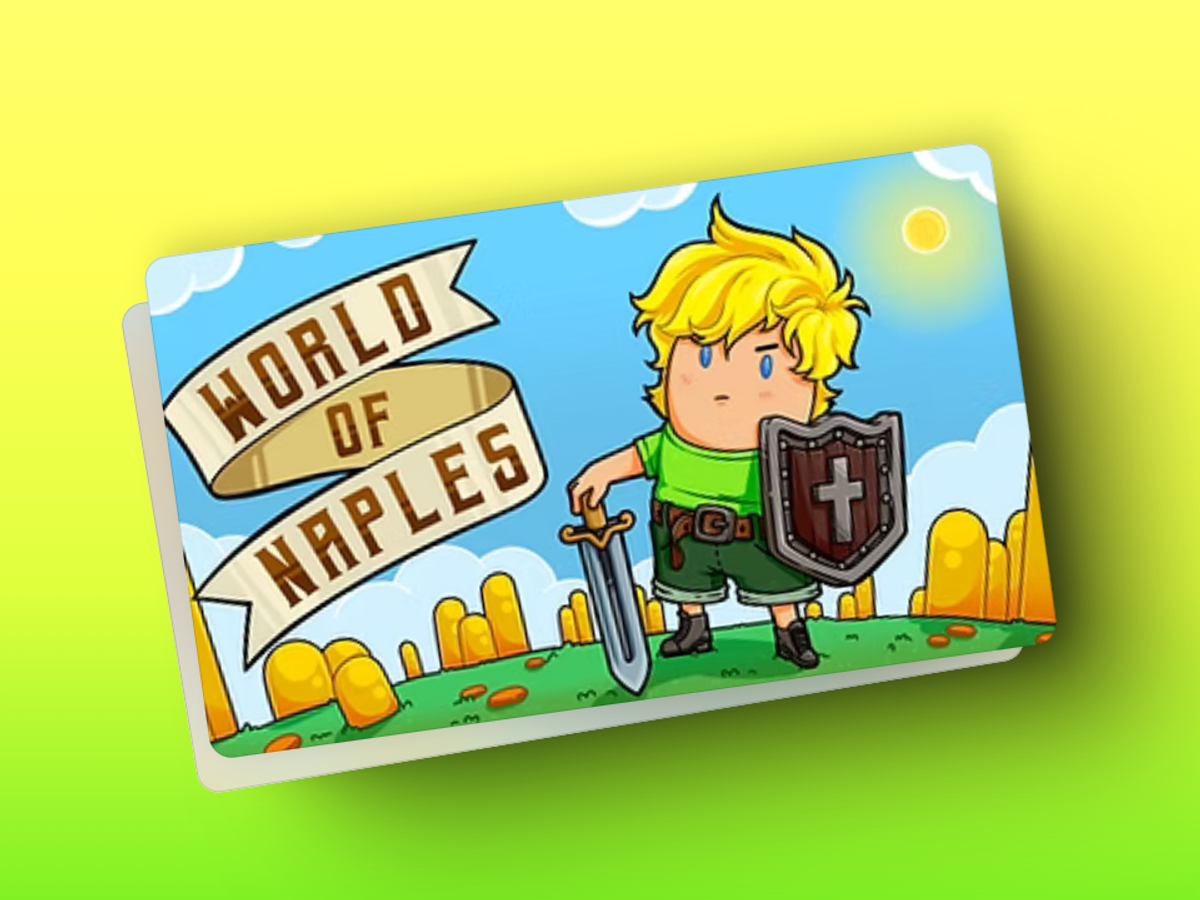
World of Naples is a 2D platformer combining speed running with roguelike elements. It features PVE levels, character selection, quotes from notable thinkers, and arcade style play without saved progress. As part of the development team, we implemented gameplay mechanics, refined character controls, and optimised level generation and performance across devices. The work focused on balancing difficulty and maintaining responsive movement so the game’s challenging levels remained engaging while preserving the intended retro gameplay experience.
We created a logo for Rika’s Hair Salon built around a stylised silhouette of a woman with flowing hair inside a circular border. The design reflects the salon’s focus on beauty, confidence, and hairstyling. The black, pink, and white palette combines a polished appearance with warmth and clear contrast. Simple shapes and a clear visual hierarchy make the logo suitable for storefront signage, business cards, social media profiles, and promotional materials, supporting a consistent identity across the salon’s communications.
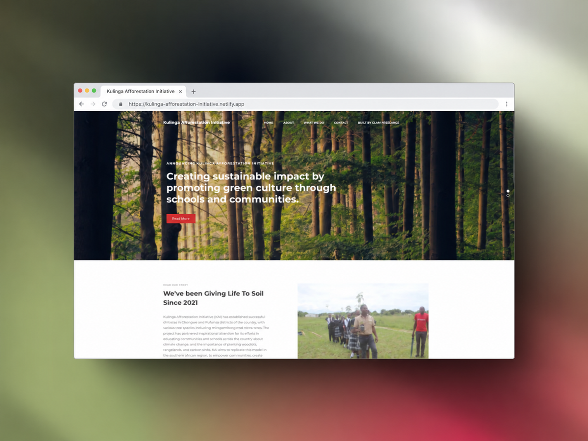
Kulinga Afforestation Initiatives (KAI) needed a website to showcase its reforestation and sustainable agriculture work, including orchards in Chongwe and Rufunsa, Zambia. The site needed to inform the public and help potential partners and donors understand its initiatives. We developed a responsive website with an interactive gallery, a blog for project updates, and donation and contact sections. Clear navigation and an organised content structure made the organisation’s environmental work easier to explore and provided ways for visitors to get involved.
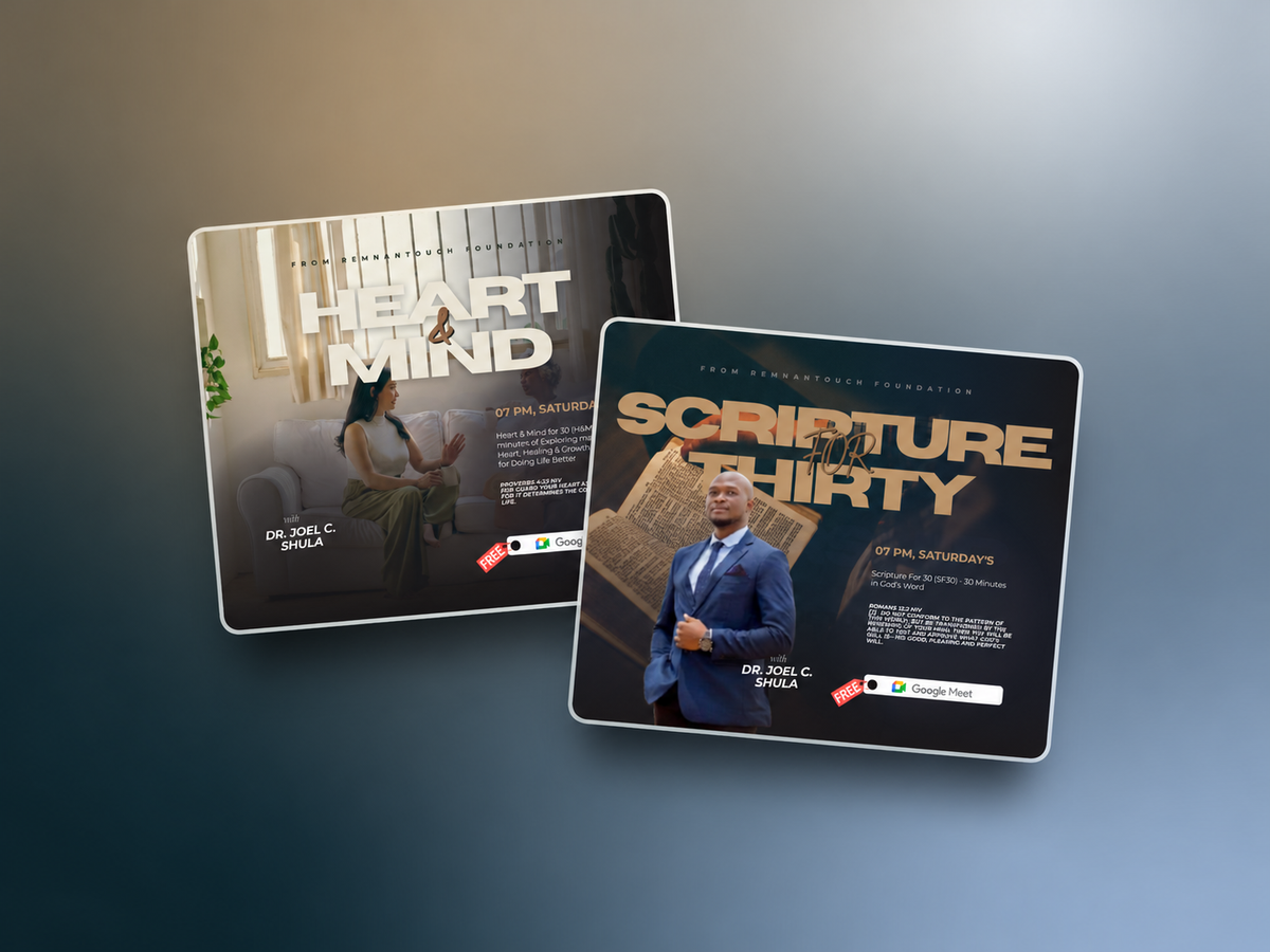
Remnantouch Foundation commissioned promotional flyers for the launch of For 30 Sessions, including Scripture For 30, Worship For 30, and Mind & Heart For 30. The initiative centres on 30 minute sessions for spiritual reflection, worship, and emotional wellbeing. Working with direction and content guidance from Dr. Joel, we designed a coordinated flyer series that explained each session’s focus. Consistent branding connected the individual designs while allowing their different themes to remain clear, giving the foundation materials for promoting the programme across platforms.
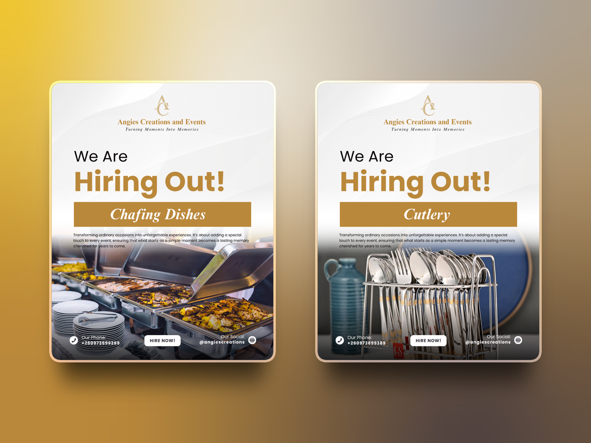
We had the opportunity to develop a cohesive brand identity for Angie's Creations & Events Ltd. This project involved creating a unified color palette and design scheme to ensure consistency across all company updates and materials. Our goal was to provide a professional and visually appealing theme that accurately represents their brand across all platforms.
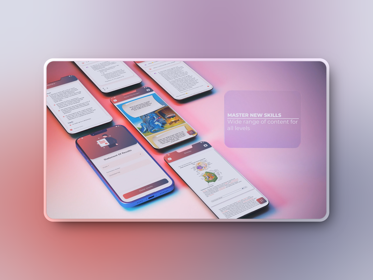
My Personal Tutor is an independent educational app for Zambia, built with Flutter for iOS and Android. It combines AI powered past paper exams, an educator freelancing platform, and a digital library. The development work covered AI based exam analysis and grading, a marketplace for educators, secure payments for premium features, and real time interactions. Particular attention went into structuring the student and educator journeys and building a responsive interface that brought these learning and marketplace features into one application.
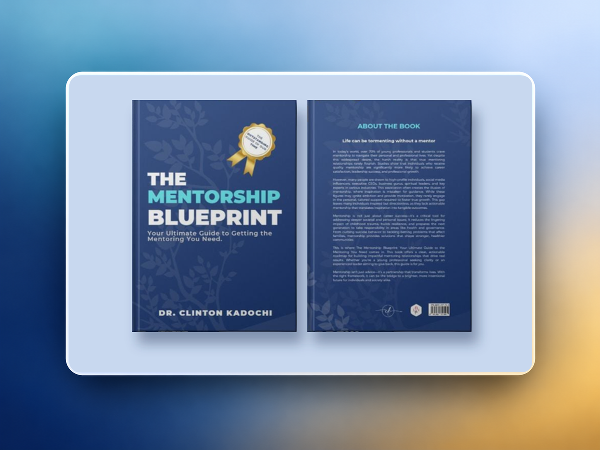
Dr. Clinton Kadochi commissioned the cover design for The Mentorship Blueprint alongside editorial and typesetting work. We developed the visual concept around the book’s themes of guidance, growth, leadership, and legacy, selecting colours, typography, and imagery in collaboration with the author. The deliverables included the front cover, back cover, and spine, incorporating the synopsis, author biography, and publishing details. We also prepared an eBook cover adaptation, mockups, and promotional graphics to support the book’s launch across print and digital channels.
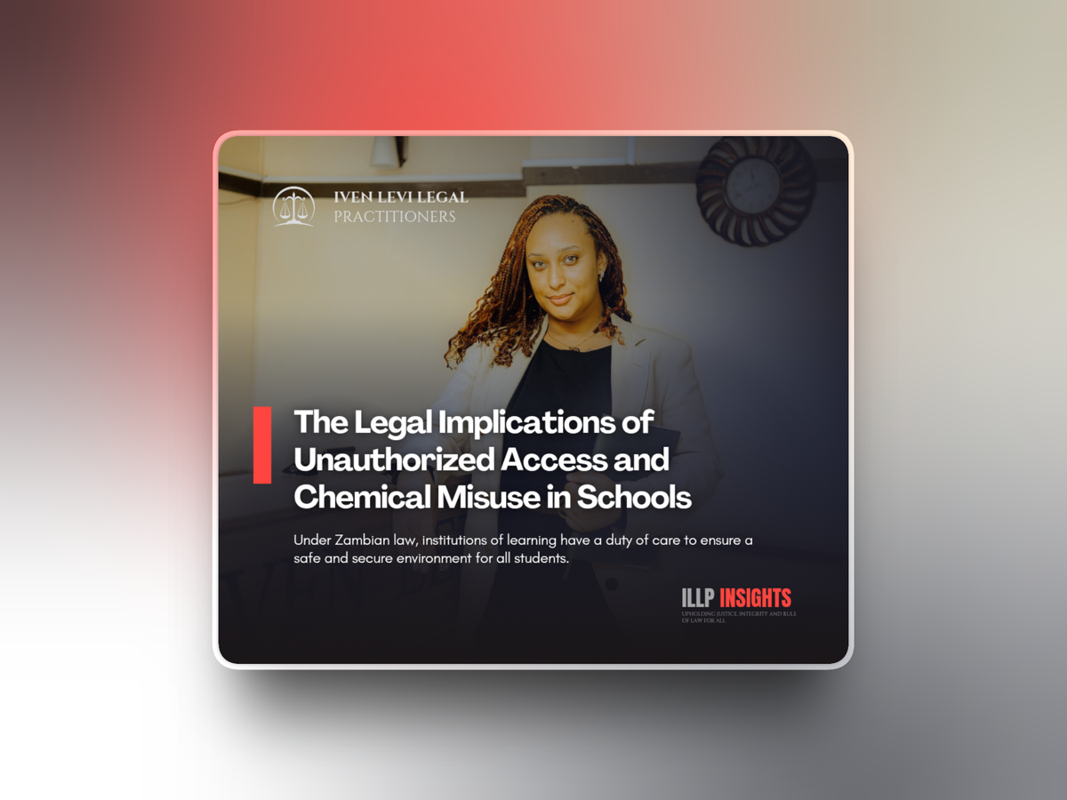
We developed and manage social media content for Iven Levi Legal Practitioners, combining legal awareness posts, firm updates, and promotional materials. The work began with a content strategy and a visual layout system based on the firm’s colours, typography, and branding. Deliverables include post templates, story highlights, and custom graphics. Our ongoing services cover scheduling, captions, hashtag research, audience engagement, and monthly performance reviews, keeping content creation, publishing, and reporting aligned with the firm’s professional identity.
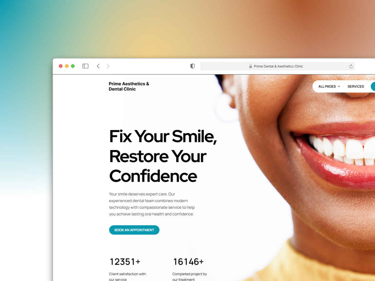
Prime Aesthetics & Dental Clinic needed a website that presented its dental and aesthetic care services in a professional, welcoming way. The design needed to communicate expertise while remaining approachable for prospective patients. We built the site around a clear hero section, straightforward service navigation, and generous spacing. The colour palette and typography supported a modern, reassuring visual direction, while the page structure helped visitors explore the clinic’s services and find their way to booking an appointment.
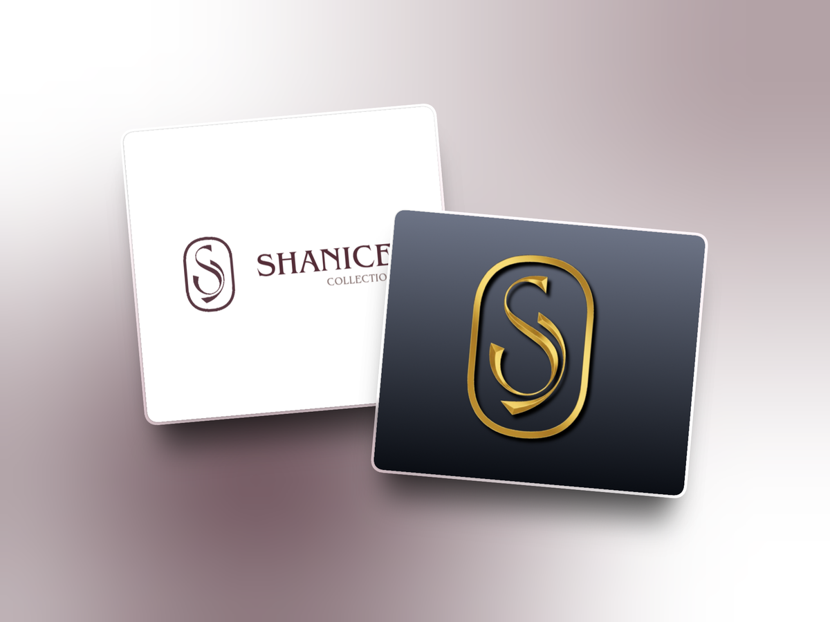
Shanice Collection approached us with a request to create a distinctive and elegant logo that would represent their men’s clothing brand. The client wanted a design that reflected luxury, confidence, and class, aligning with their brand’s vision of offering “Elegance in Every Thread.” After a detailed consultation to understand their style preferences and color direction, we developed a modern, gold embellished monogram paired with sophisticated typography. The final logo perfectly captures the brand’s refined aesthetic and serves as a timeless identity for Shanice Collection across all platforms from signage to digital use.
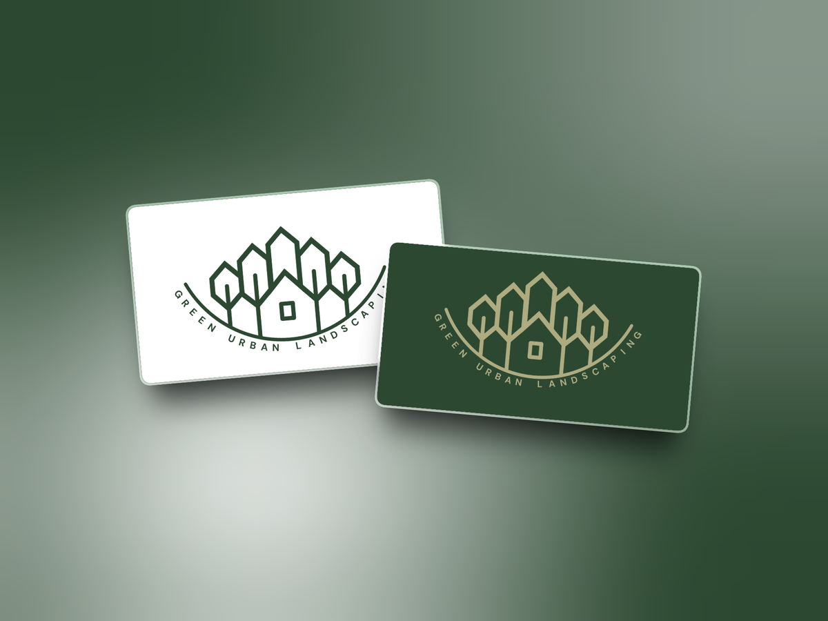
We designed a logo for Green Urban Landscaping to express nature, growth, and the connection between planted spaces and urban environments. The mark features stylised trees in a crown like arrangement around a central square element. A green and tan palette pairs natural vitality with earthy warmth. The design uses simple forms and a clear visual hierarchy so it can be applied consistently across business cards, vehicle wraps, signage, and digital platforms while maintaining a recognisable identity.
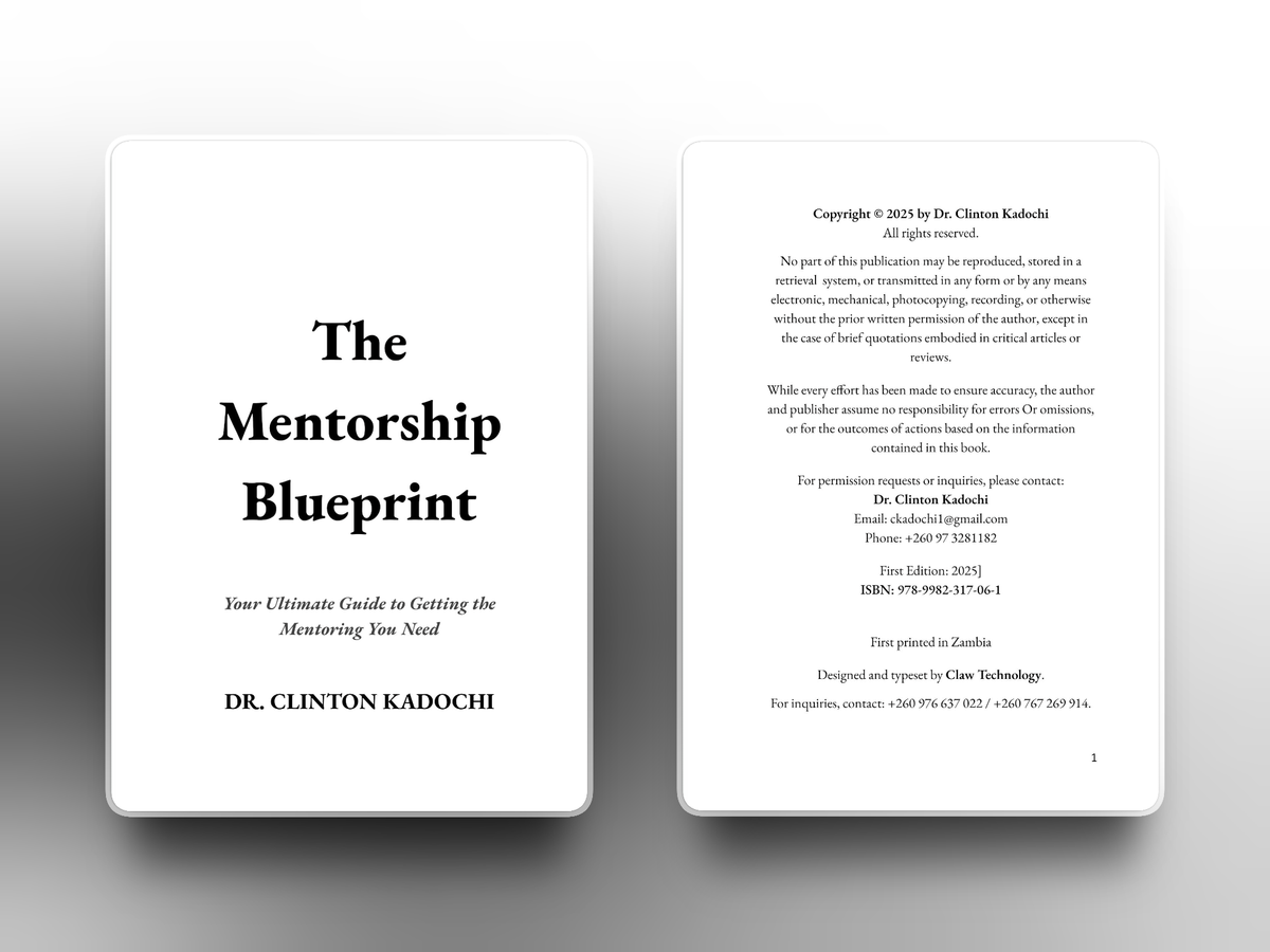
Dr. Clinton Kadochi engaged us to typeset and format The Mentorship Blueprint under our standard service option. The brief was to make a personal work on mentorship clear and readable while preserving the author’s voice and vision. We transformed the final manuscript into a cohesive interior layout, attending to structure, presentation, and publishing requirements. The completed formatting prepared the book’s interior for publication and gave the mentorship content an organised, readable presentation aligned with the author’s expectations.
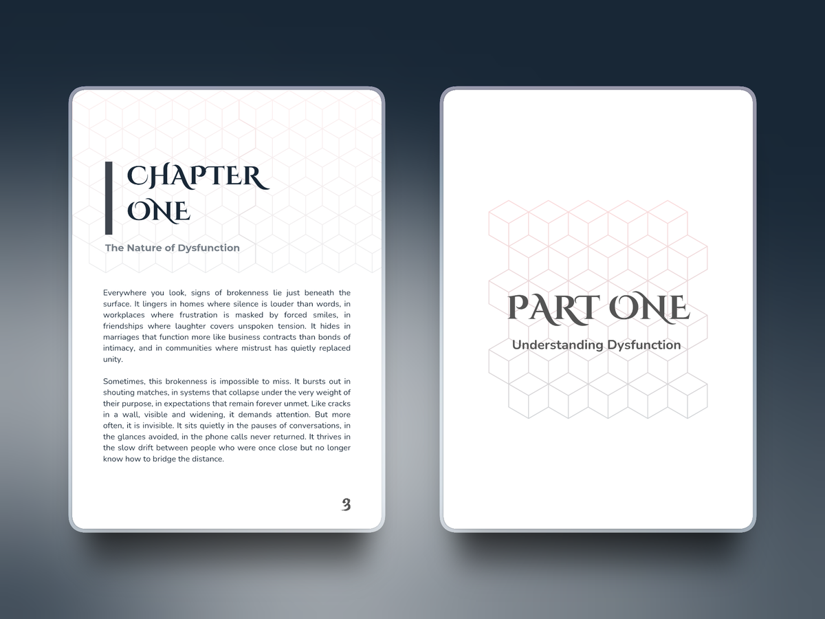
Dysfunction, authored by Harvey and coauthored by Dr. Clinton Kadochi, was published under My Personal Tutor. We supported the manuscript’s preparation for publication, with attention to preserving the clarity and depth of its exploration of people and systems. Our services covered editing, proofreading, typesetting, and ISBN acquisition. We refined the text for accuracy and flow, created a readable interior layout, and managed ISBN registration, bringing together the editorial, formatting, and registration work needed to prepare the book for distribution.
The creation of the Guzzlers Reloaded logo focused on developing a bold and energetic mark that reflects excitement, movement, and a modern entertainment driven brand identity. The logo was designed using strong, expressive forms inspired by being more focused on visibility, ensuring high visibility and immediate recognition across all applications. Emphasis was placed on clarity, balance, and adaptability so the logo performs effectively across digital platforms, merchandise, promotional materials, and large scale signage while maintaining a distinctive, confident appearance aligned with Guzzlers Reloaded’s vibrant and dynamic brand personality.
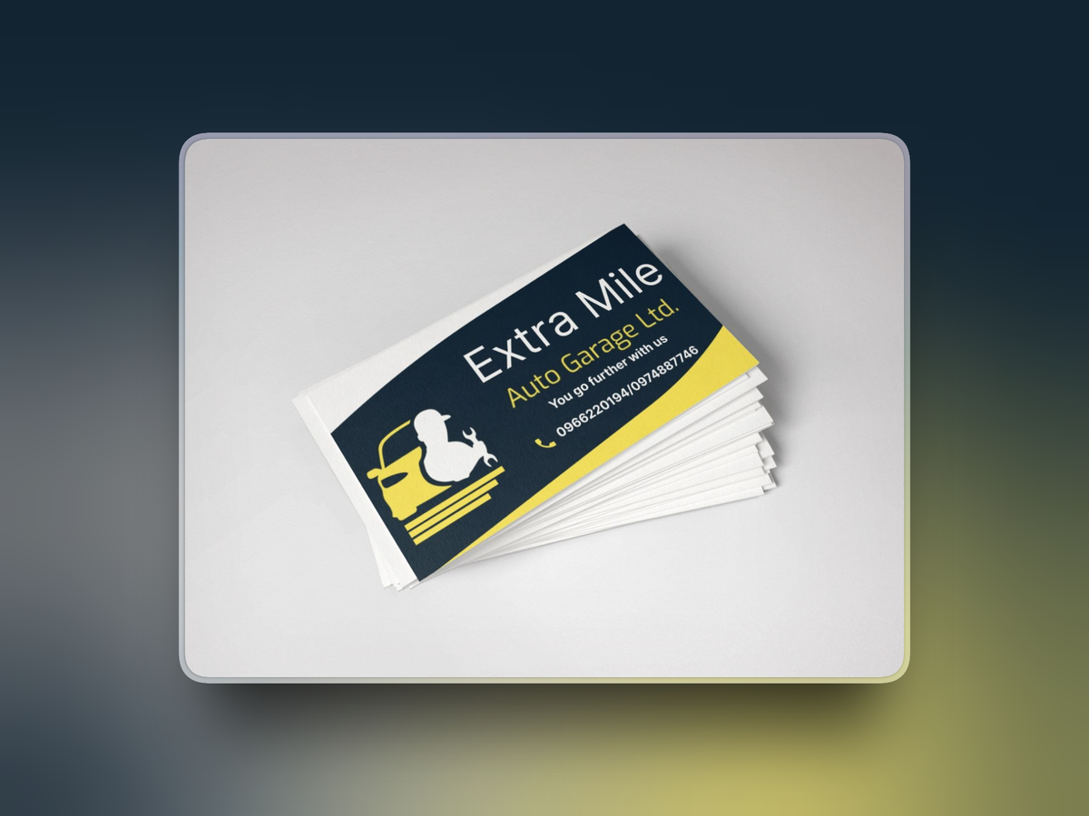
Extra Mile Auto Garage commissioned a brand identity for its automotive repair business. We researched automotive branding, developed logo sketches, and refined a minimalist wrench and road concept reflecting the idea of going “the extra mile.” The identity uses deep navy, custard yellow, and white with Inter Sans typography. We created digital mockups for service brochures, vehicle magnets, staff uniforms, and business cards using Inkscape and Figma templates, helping the client see how the visual system would work across its materials.
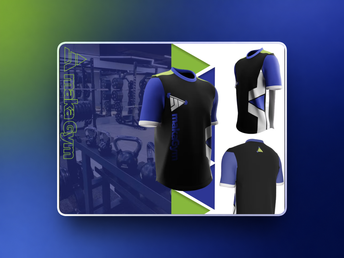
We collaborated with Amaka Gym to support their rebranding by offering graphic design services aimed at creating a more modern, bold, and professional brand identity. The goal was to refresh their visual presence while keeping an energetic and motivating feel that speaks to fitness driven audiences. Our work included redesigning the gym’s logo to give it a cleaner and more contemporary look, as well as refining the overall visual direction. A cohesive colour palette of white, purple, green, and black was developed to reflect strength, vitality, and confidence.
Hossain Enterprises Ltd needed a refreshed identity for its construction and engineering services across residential, commercial, and industrial projects. The brief called for a modern logo and a consistent colour scheme that reflected the company’s expertise and evolving services. We designed a bold, clean logo and developed a coordinated palette around trust, stability, and innovation. The identity was intended for consistent use across company materials, from project proposals to site signage, giving the business a unified visual direction.
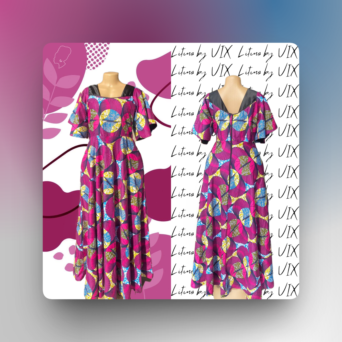
Vix commissioned a brand identity for Litino, her bespoke tailoring business. Following fashion branding research and sketches, we developed vector artwork in Adobe Illustrator featuring a minimalist outline of a woman wearing a bonnet. The palette combines warm taupe, soft ivory, and muted gold. Send Flowers and Sans were selected for the logo and headings, with Lato for body text. We used Adobe Photoshop templates to create mockups for promotional materials, tote bags, and business cards, illustrating the identity across practical applications.

Keystone Manager is a business management software product developed and operated by Claw Technology. It is listed as one of Claw Technology’s products on our official website and is the customer facing brand used for the platform and its communications.
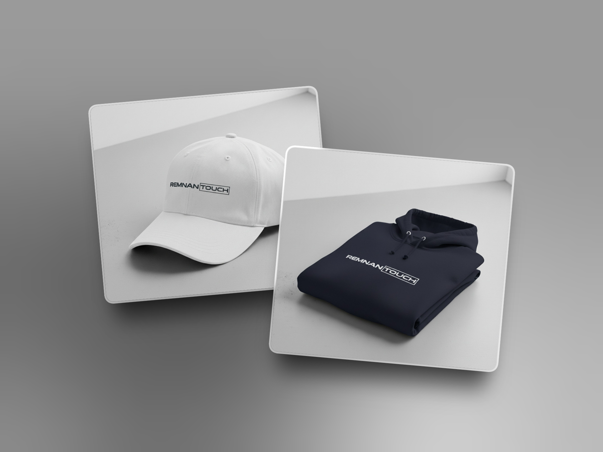
We designed logo mockups for Remnantouch Foundation applied specifically on clothing. The goal was to visualize how the rebranded logo would appear on branded apparel, creating a clean, professional, and inspiring look that aligns with the foundation’s identity and outreach efforts.
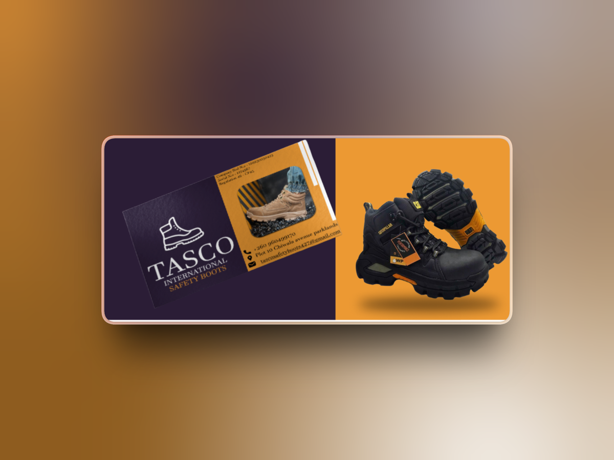
We supported TASCO International Safety Boots with a clearer visual identity and marketing materials for its protective footwear business. The work included a logo redesign, consistent messaging, and the tagline “Safety From the Ground Up.” The wider project also covered an ecommerce website redesign with industry specific categories, product specifications, safety certification information, and an interactive boot selector. Supporting content included guides for choosing workplace footwear, helping present TASCO’s products and specialised knowledge consistently across its marketing and digital channels.
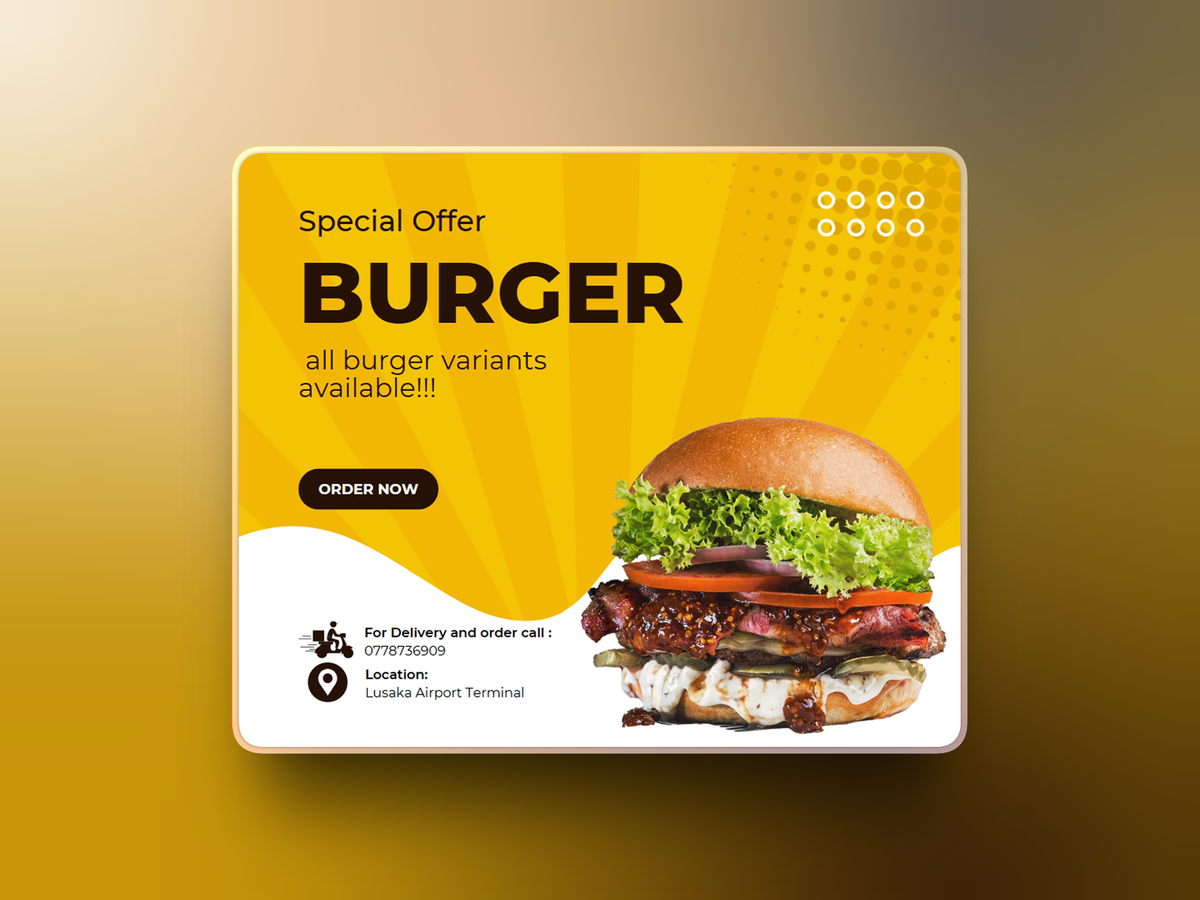
Terminal 2 Sports Bar commissioned promotional flyers to introduce the venue’s offerings and reach both new and returning customers. The designs needed to communicate events, specials, and services clearly while reflecting the atmosphere of the bar and restaurant. We created custom layouts for print and digital distribution, balancing the promotional information with an appealing visual presentation. The finished materials gave the venue a consistent way to publicise its activities and maintain a professional appearance across its marketing channels.
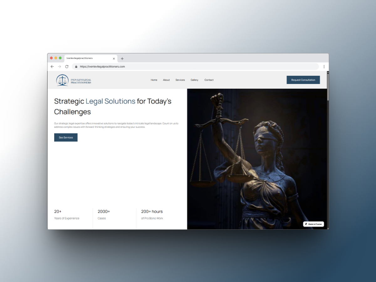
Iven Levi Legal Practitioners needed a portfolio website to introduce the firm, present its services, and help prospective clients find essential information. The brief prioritised a professional appearance, straightforward navigation, and a blog for sharing legal insights. We designed a responsive website highlighting key services and client testimonials, with an easy to update blog integrated into the content management setup. The layout focused on clear information and mobile accessibility so visitors could explore the firm’s work across devices.
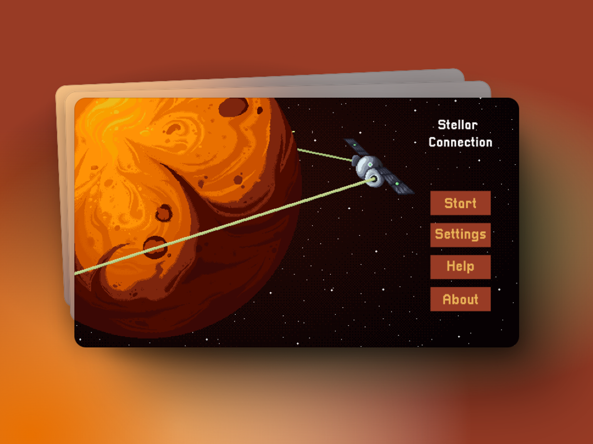
Stellar Connection is a space defense game built with Godot. Players protect Mars from alien rays using a spaceship and a satellite network that must stay powered, combining shooting with strategic resource maintenance. Our work focused on balancing difficulty, refining spaceship movement and shooting, and tuning enemy AI patterns and the wave system. We also developed an intuitive system for keeping satellites connected, bringing the game’s movement, combat, and network management mechanics together into a responsive gameplay experience.
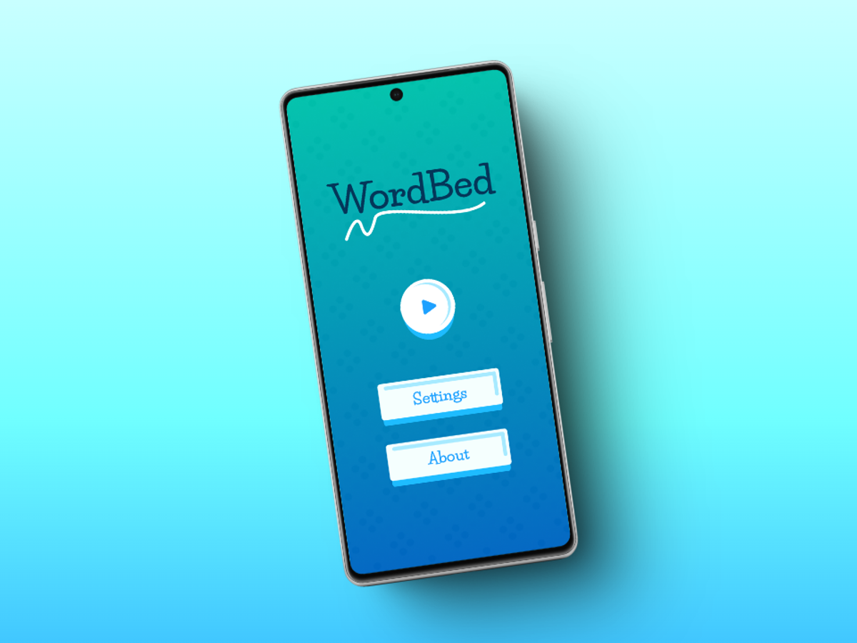
Wordbed is a mobile puzzle game built with Godot, inspired by Scrabble. Players form words by connecting adjacent letter tiles on a grid, combining vocabulary with strategic choices. We developed a custom letter generation algorithm to balance randomness and playability, helping ensure the board offered useful word building opportunities. The work also covered an accessible interface and refined touch controls, with attention to making the game straightforward to learn while retaining enough variety and depth for repeated play.
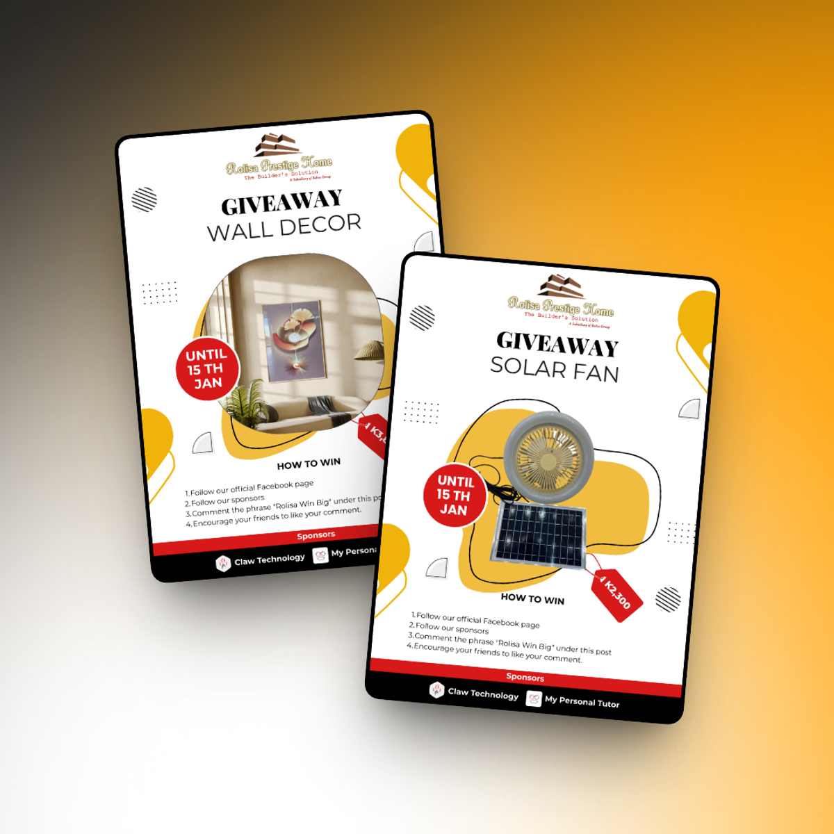
Rolisa Prestige Home commissioned flyers for a Facebook exclusive giveaway campaign. The brief was to communicate the prizes and entry requirements clearly while preserving the home décor brand’s luxury aesthetic. We developed layouts that placed the prize products prominently, used the brand’s established colour palette, and kept instructions easy to follow in Facebook’s feed. Although initially planned as animated content, the project also included optimised static versions for consistent display across platforms and aspect ratios. The campaign launched in December.
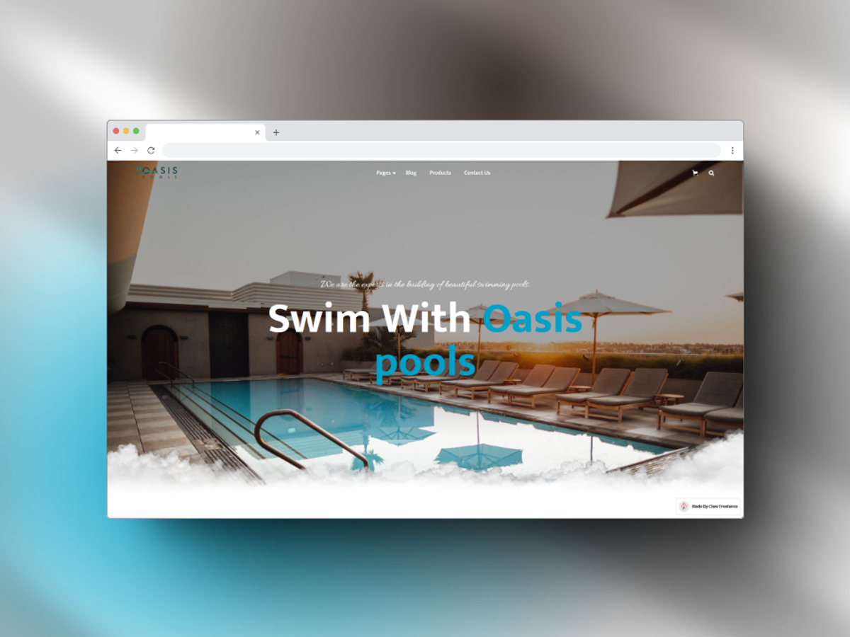
Oasis Pool Zambia needed a portfolio website covering swimming pool construction, maintenance, and pool product retail. The site needed to showcase completed work, explain the different services, and provide a clear route for prospective customers to enquire. We created a responsive website with a detailed services section and a project gallery supported by strong visuals. A contact form and call to action buttons connected visitors with the business, while the page structure kept its construction, maintenance, and retail offerings easy to navigate.
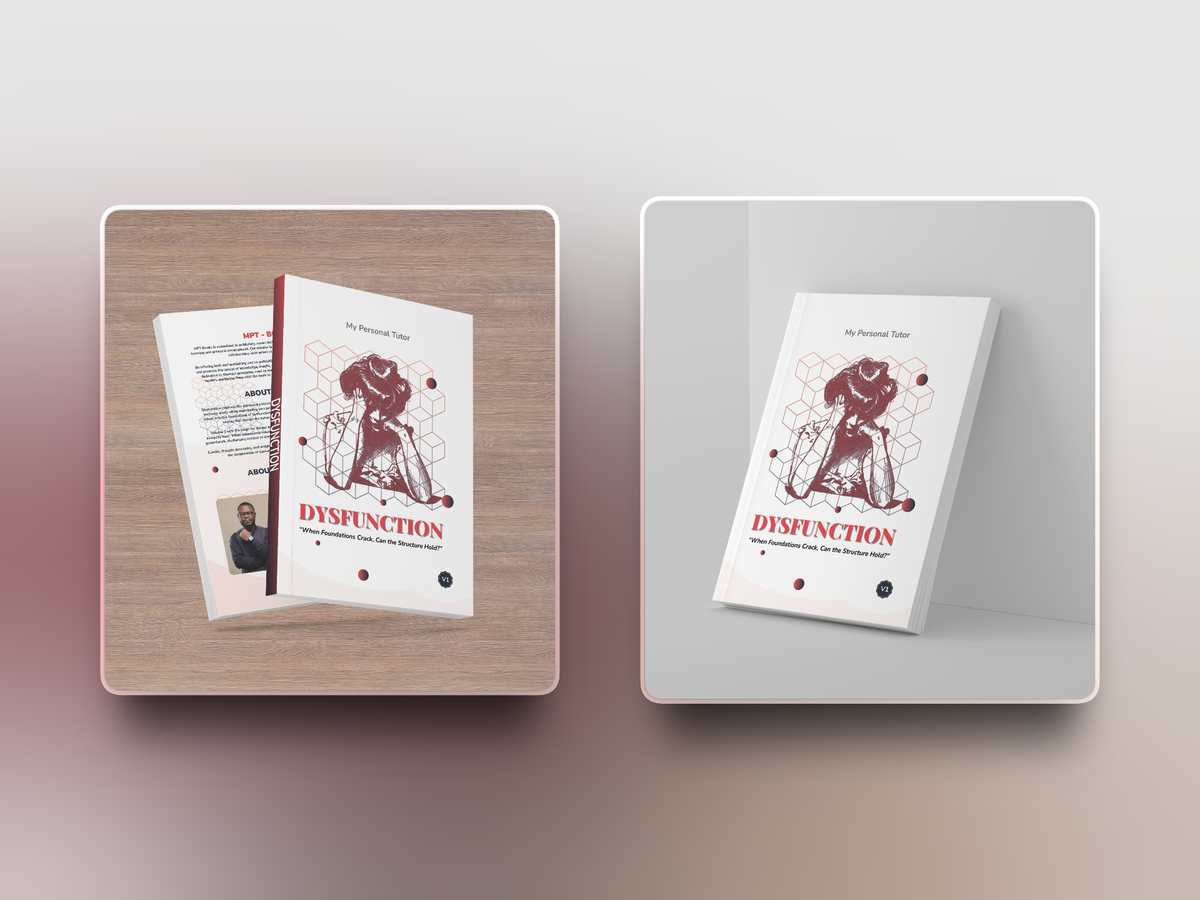
We proudly took part in the creative process behind the cover design of Dysfunction, a thought provoking book released under My Personal Tutor. From the early stages of concept development, we worked closely with the author to capture the book’s raw, introspective themes through powerful visual storytelling. Our design approach focused on balancing simplicity and impact using clean typography and layered imagery to reflect the emotional weight of dysfunction in personal and generational spaces. The result was a striking front and back cover layout that speaks to both the struggles and resilience explored within the book.
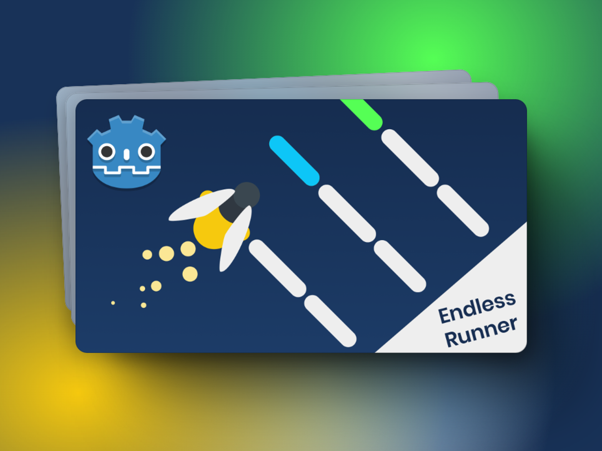
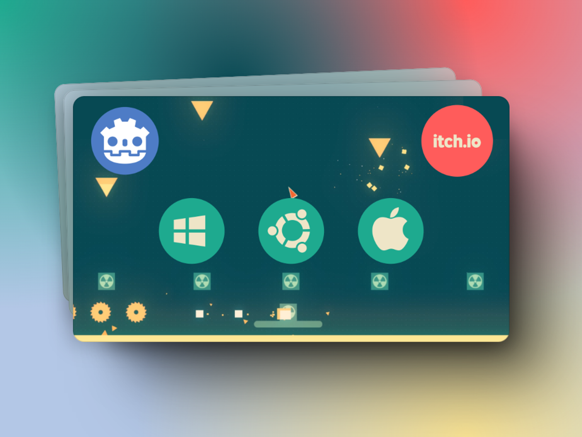
Phase is an endless runner built with Godot, following a firefly through a changing environment. Players avoid obstacles and survive for as long as possible, with dynamic lighting contributing to the game’s atmosphere. Our work focused on refining the firefly’s movement, physics, and animation for fluid control. We also optimised performance across devices and tuned the lighting effects, balancing the visual experience with smooth mechanics so the game remained responsive as players navigated its changing conditions.
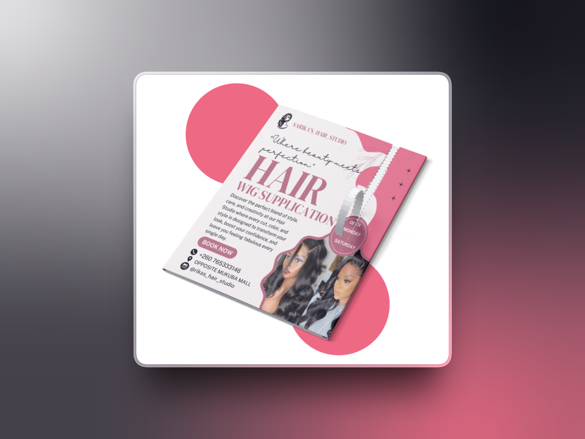
We worked with Rika’s Salon to refresh its visual identity, redesigning the logo and developing colour and typography guidelines. The direction used the Sandora font and a pink and white palette to create a consistent presentation for the business. The project included business cards, appointment cards, service menus, and promotional posters. We also provided a brand style guide and training on using branded templates, helping the salon apply its identity consistently when producing updates and marketing materials.
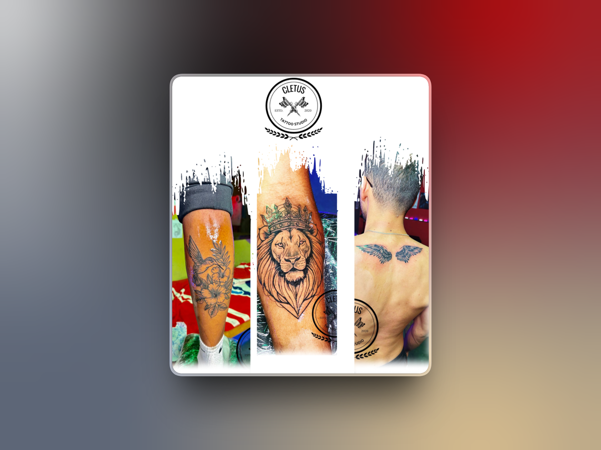
Cetus Tattoos commissioned promotional banners to present its services and strengthen the artist’s visual presence. The brief called for a bold, professional design that reflected the artist’s style and appealed to potential clients within the tattoo community. We designed custom banners for physical and digital promotional spaces, balancing the brand identity with clear service information. The resulting layouts gave the business materials for client outreach and promotion while keeping the artist’s work and services central to the message.
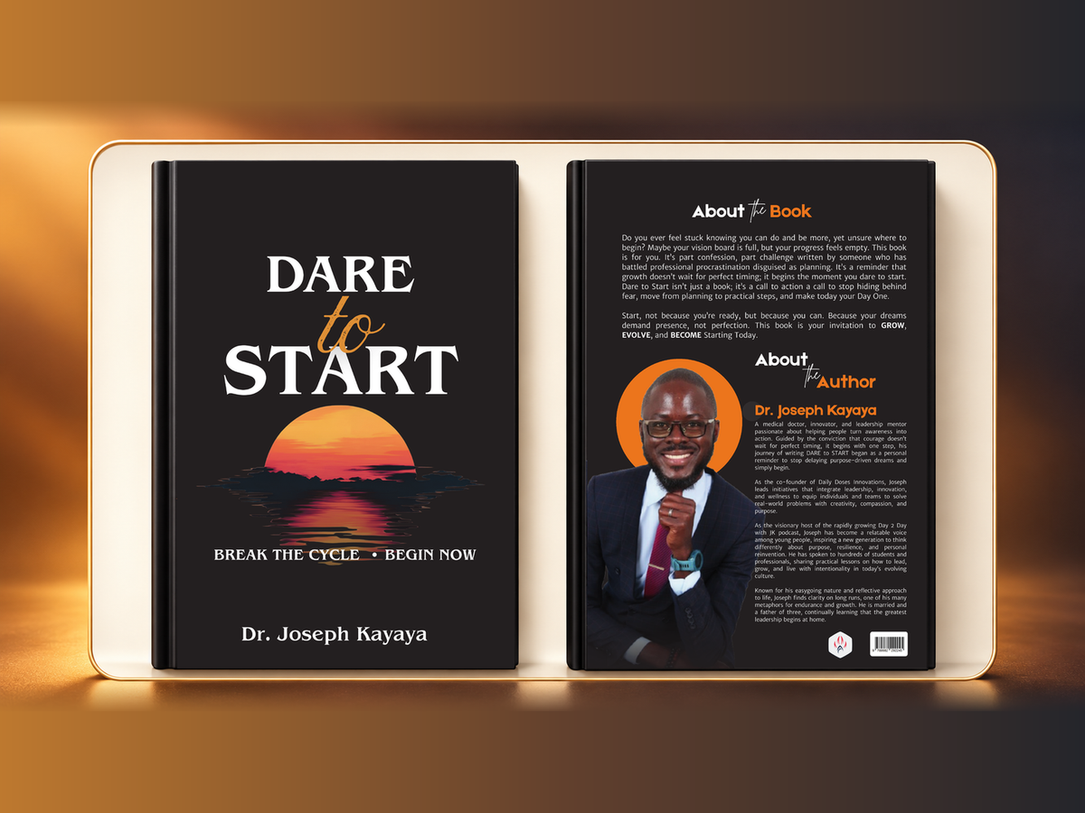
We designed the cover for Dr. Joseph Kayaya’s Dare to Start, capturing the essence of motivation, growth, and taking the first bold step. The design combines striking visuals and typography to create an eye catching and professional look that resonates with the target audience.
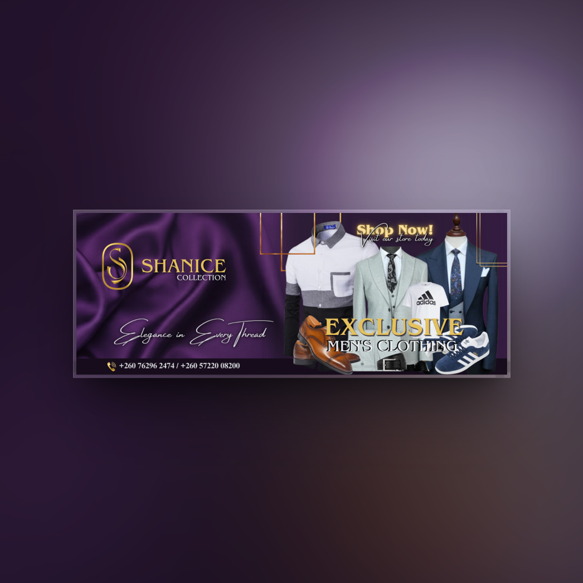
Shanice Collection needed a banner for its men’s clothing brand, suitable for the store entrance and promotional platforms. The brief called for an elegant, professional presentation aligned with the slogan “Elegance in Every Thread.” After discussing the brand’s theme and visual preferences, we designed a banner with a royal purple background, gold accents, and refined typography. The layout highlighted the clothing offering while carrying the same visual identity across storefront display and promotional use.
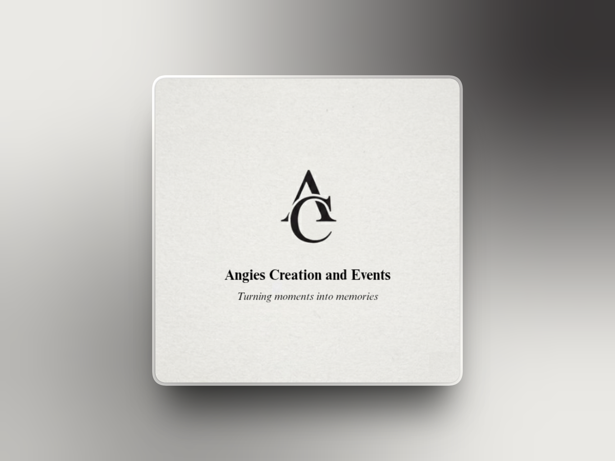
We had the pleasure of rebranding the logo for Angie's Creations & Events Ltd. The previous design lacked professionalism and did not reflect the quality of their services. Our task was to create a modern, professional logo that truly represents their brand identity and appeals to their target audience.
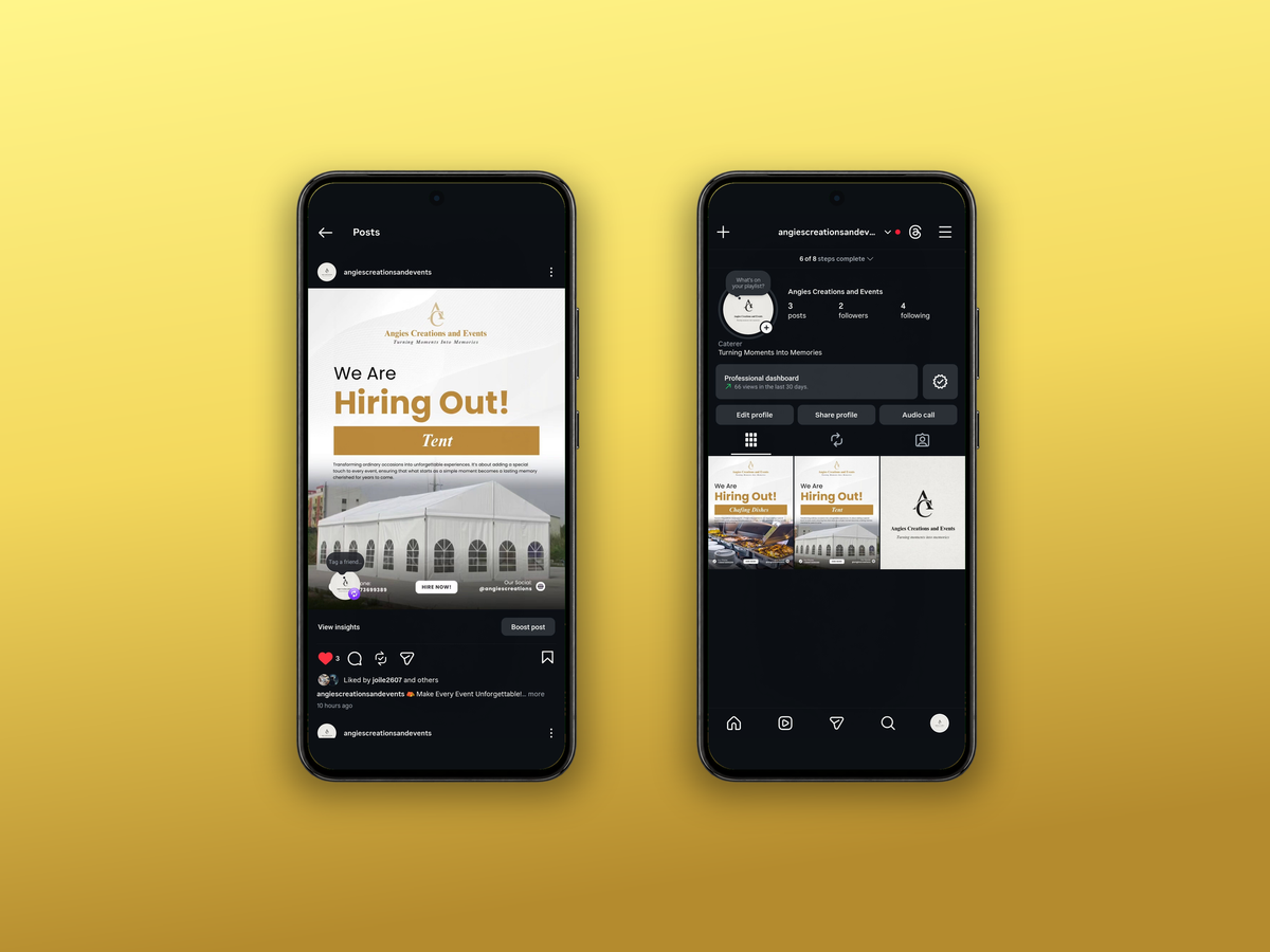
We manage the social media presence of Angie’s Creations & Events Ltd, ensuring consistent branding and engaging content across all platforms. Our focus is on crafting captivating visuals, maintaining audience engagement, and promoting their services effectively through strategic posting schedules and targeted campaigns.
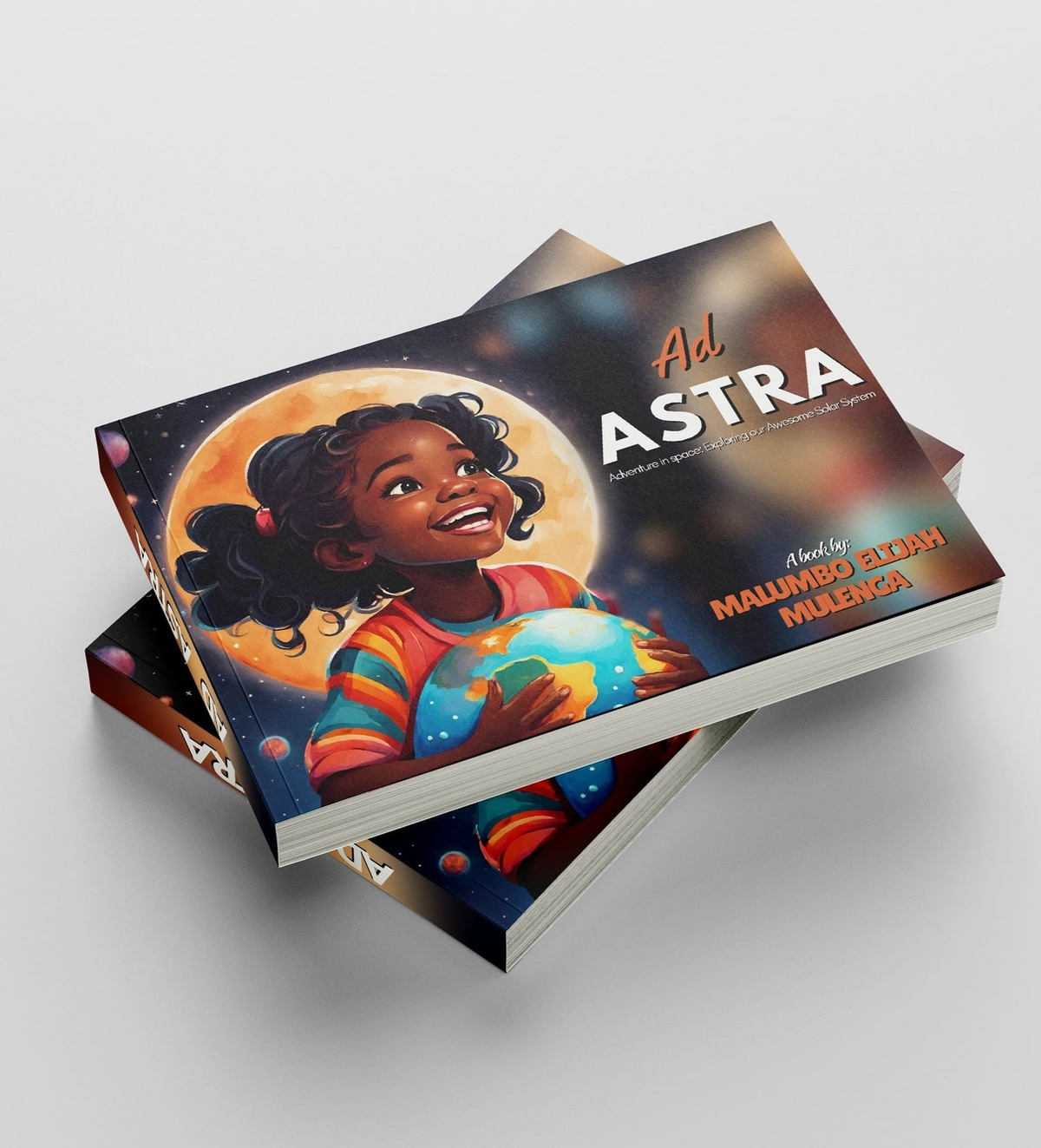
Ad Astra: A Fun Learning Journey, authored by Malumbo Elijah Mulenga, introduces young readers to planets, moons, and the wider solar system. The manuscript needed an approach that balanced playful exploration with clear, organised information. We provided editing, proofreading, typesetting, and formatting, refining the text for readability, accuracy, and consistency. We then developed an engaging layout suited to the book’s educational content, preparing a publication ready manuscript that preserved the author’s spirit of curiosity and exploration.
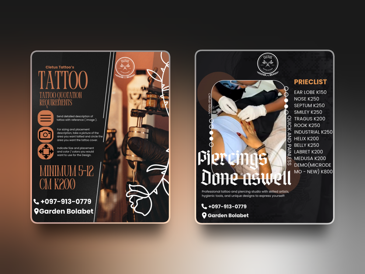
We worked with Cetus Tattoo to create promotional materials that reflected the artist’s style and communicated the services offered. The aim was to build a consistent visual presence and make the business’s work easier for potential clients to discover. The project included custom flyers and banners for print and digital use. We combined bold graphics with clear service information, giving the artist a coordinated set of materials for promoting tattoo services and reaching the wider tattoo community.
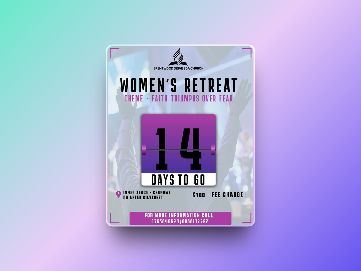
Brentwood Drive SDA Church commissioned a countdown graphic for its Women’s Retreat, themed “Faith Triumphs Over Fear.” The design needed to build anticipation while clearly presenting the remaining days and key event information. We developed a layout combining strong typography, soft imagery, and a cohesive colour palette aligned with the retreat’s theme. Prepared for digital promotion, the graphic gave the organisers a clear visual for keeping attendees informed and engaged as the event approached.
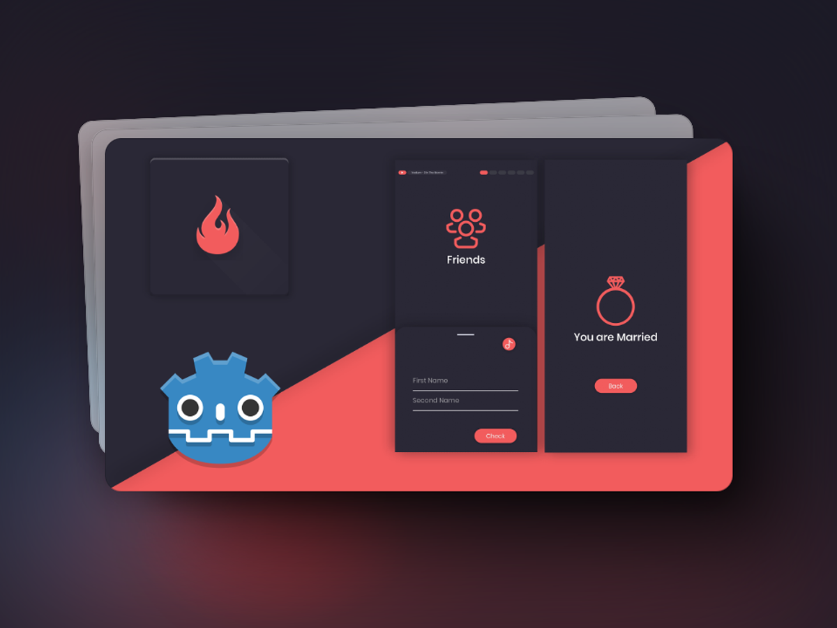
Name Fortune Teller is a lighthearted app built with Godot that compares two names to produce playful predictions: Friends, Lovers, Admirers, Married, Enemies, or Secret Admirers. The client wanted a simple entertainment experience with consistent results and straightforward controls. We developed a custom algorithm that analyses the letters in both names and applies predefined rules to calculate an outcome. The work also covered an intuitive interface and responsive interactions, keeping the process quick and easy for users.
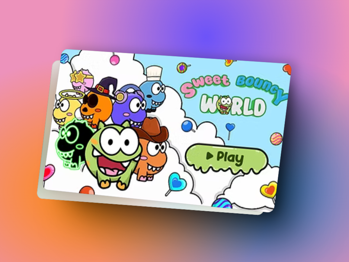
Sweet Bouncy World is an infinite platformer built with Godot by CouchBroGames. Players use left and right taps to bounce through a colourful candy world, climbing higher while avoiding obstacles and enemies. Our work focused on refining the jumping mechanics, controls, and physics for precise, responsive movement. We also implemented a competitive leaderboard with backend integration to track and display high scores, adding a way for players to compare their progress and compete across repeated runs.
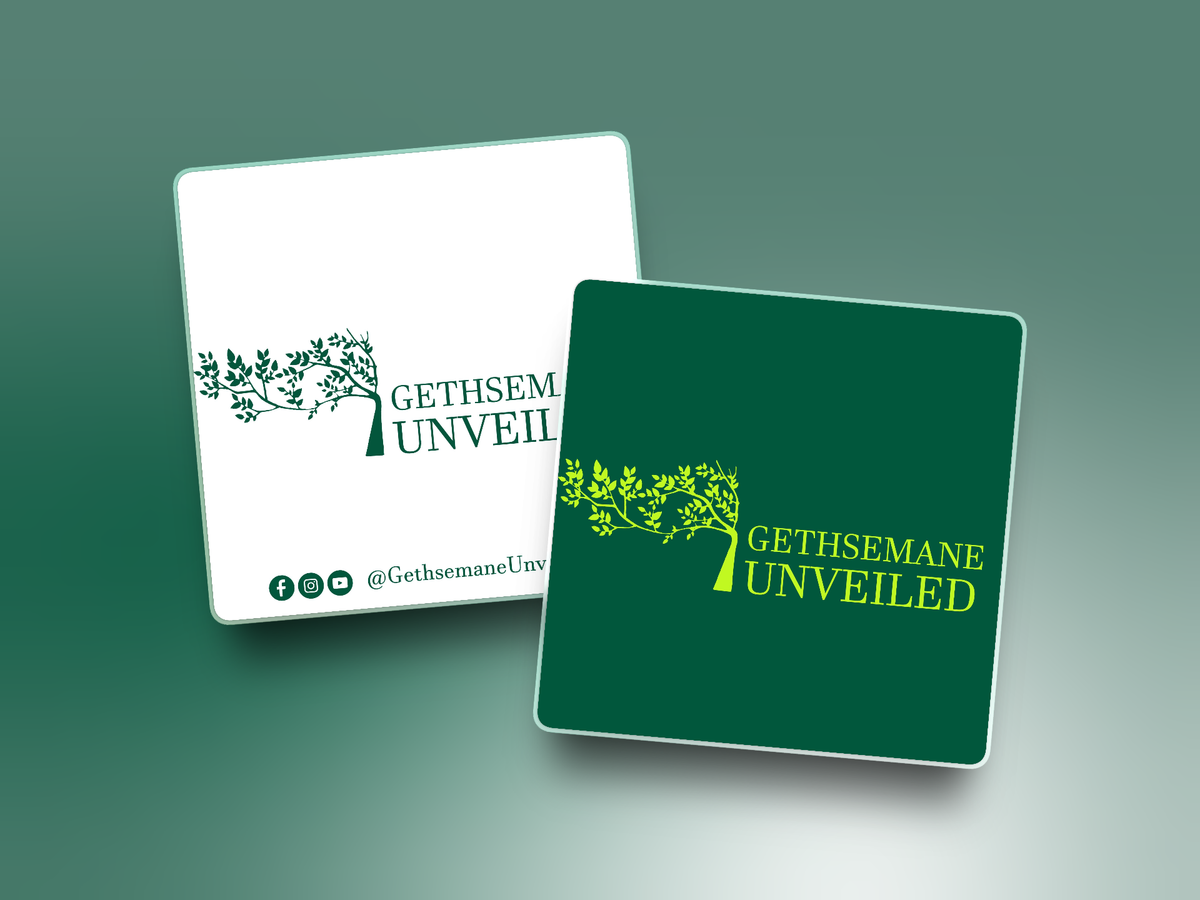
The creation of the Gethsemane Unveiled logo focused on developing a calm, reverent, and meaningful visual identity that reflects spiritual depth and reflection. The design draws inspiration from the olive tree associated with the Garden of Gethsemane, symbolizing prayer, endurance, and divine surrender. A refined serif typeface was chosen to convey timelessness and credibility, while the deep green color palette reinforces themes of growth, faith, and renewal. Emphasis was placed on simplicity and balance to ensure the logo remains clear, recognizable, and adaptable across digital platforms for the religious podcast brand.
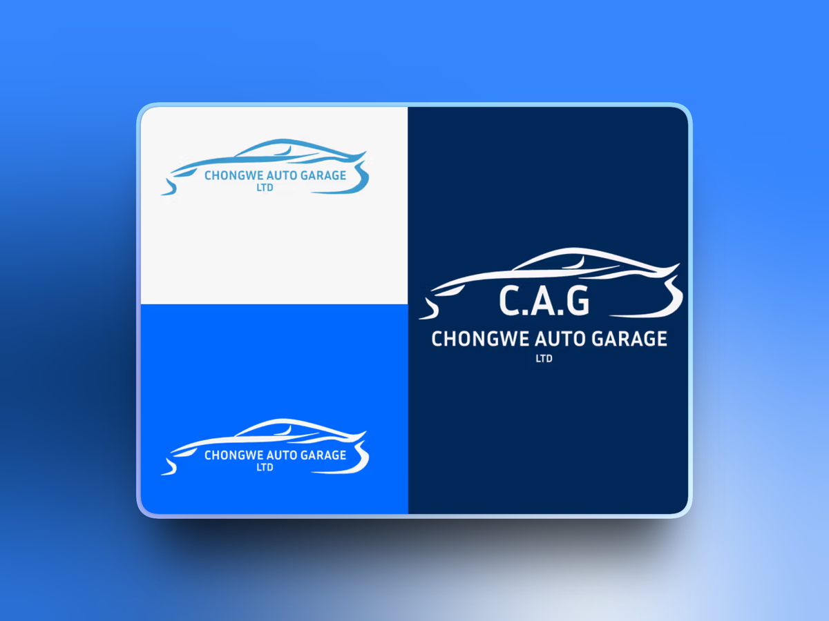
The creation of the C.A.G. logo focused on developing a strong, recognizable mark that reflects reliability and technical expertise in the automotive industry. The logo was designed using clean, bold forms inspired by mechanical elements, ensuring clarity and visibility across all applications. Emphasis was placed on simplicity and balance so the logo could scale effectively from small print materials to large workshop signage while maintaining a professional and trustworthy appearance aligned with Chongwe Auto Garage’s brand values.
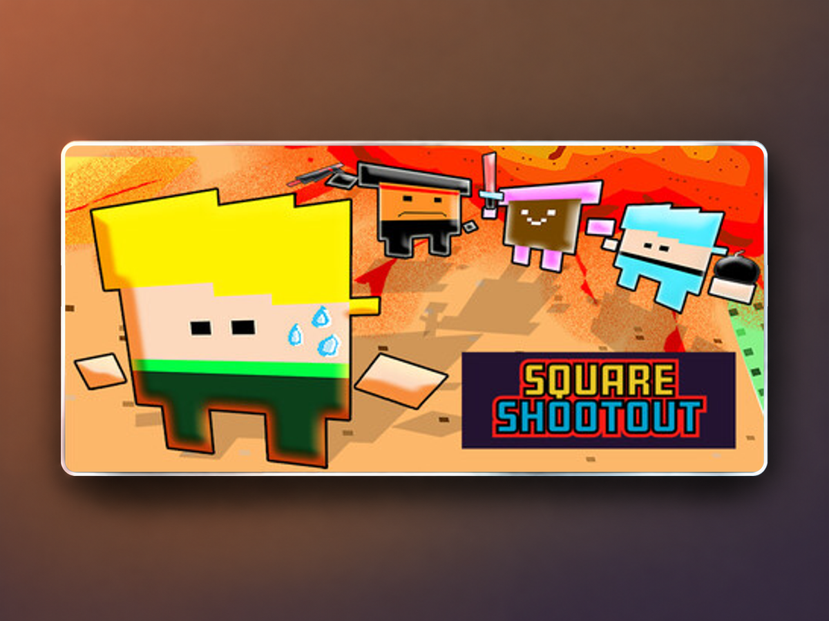
Square Shootout is a colourful party brawler from Couch Bro Games, Inc., featuring block characters, unusual weapons and arena combat for up to four players. It combines controller friendly local multiplayer with Steam Remote Play Together for shared play with friends. Our contribution to Square Shootout focused on bug fixing.
The creation of the Tasco International Safety Boots logo focused on developing a bold and authoritative mark that reflects strength, durability, and protection within the industrial safety footwear sector. The logo was designed using solid, confident forms inspired by rugged work environments, ensuring high visibility and instant recognition across all applications. Emphasis was placed on clarity, balance, and scalability so the logo performs effectively on product branding, packaging, uniforms, and large scale signage while maintaining a professional and dependable appearance aligned with Tasco International’s commitment to safety and quality.
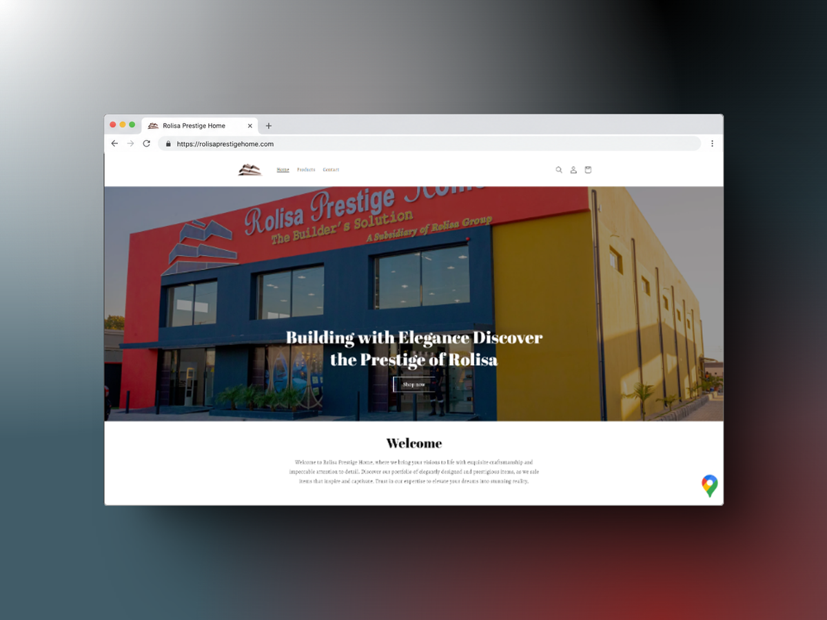
Rolisa Prestige Home needed a Shopify store that reflected its luxury home décor range while making products easy to browse and purchase. The brief combined an elegant appearance with fast loading, useful filtering, and a straightforward checkout. We customised a Shopify theme, refined the navigation, and optimised images and scripts for performance. The work also included product filtering, secure payment gateway integration, abandoned cart recovery, and analytics tracking, bringing the brand’s visual identity together with the practical requirements of its online store.
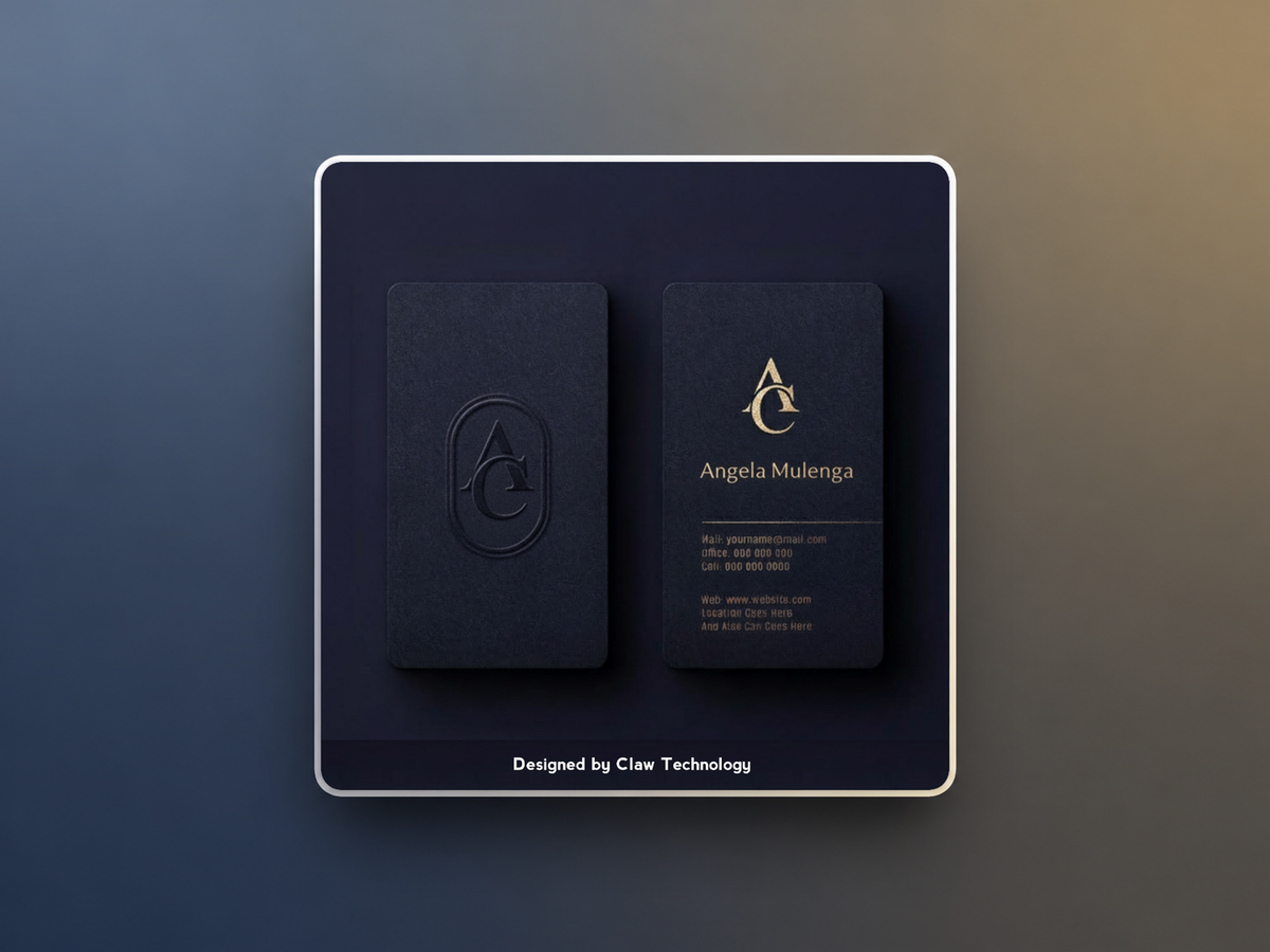
Angie’s Creations & Events Ltd commissioned a business card that reflected its event management brand. The brief called for a modern, polished design that communicated the company’s creativity, organisation, and style in a compact format. We developed the card’s colour choices, layout, and typography to align with the existing brand identity. The finished design gave the company a consistent way to introduce itself in person, with a clear visual presentation suited to professional meetings and client introductions.

Claw Technology
Innovate | Integrate | Dominate
We bring ideas to life, empowering brands to thrive in the digital age
Copyright © Claw Technology | All Rights Reserved | Terms and Conditions | Privacy Policy